Release Notes
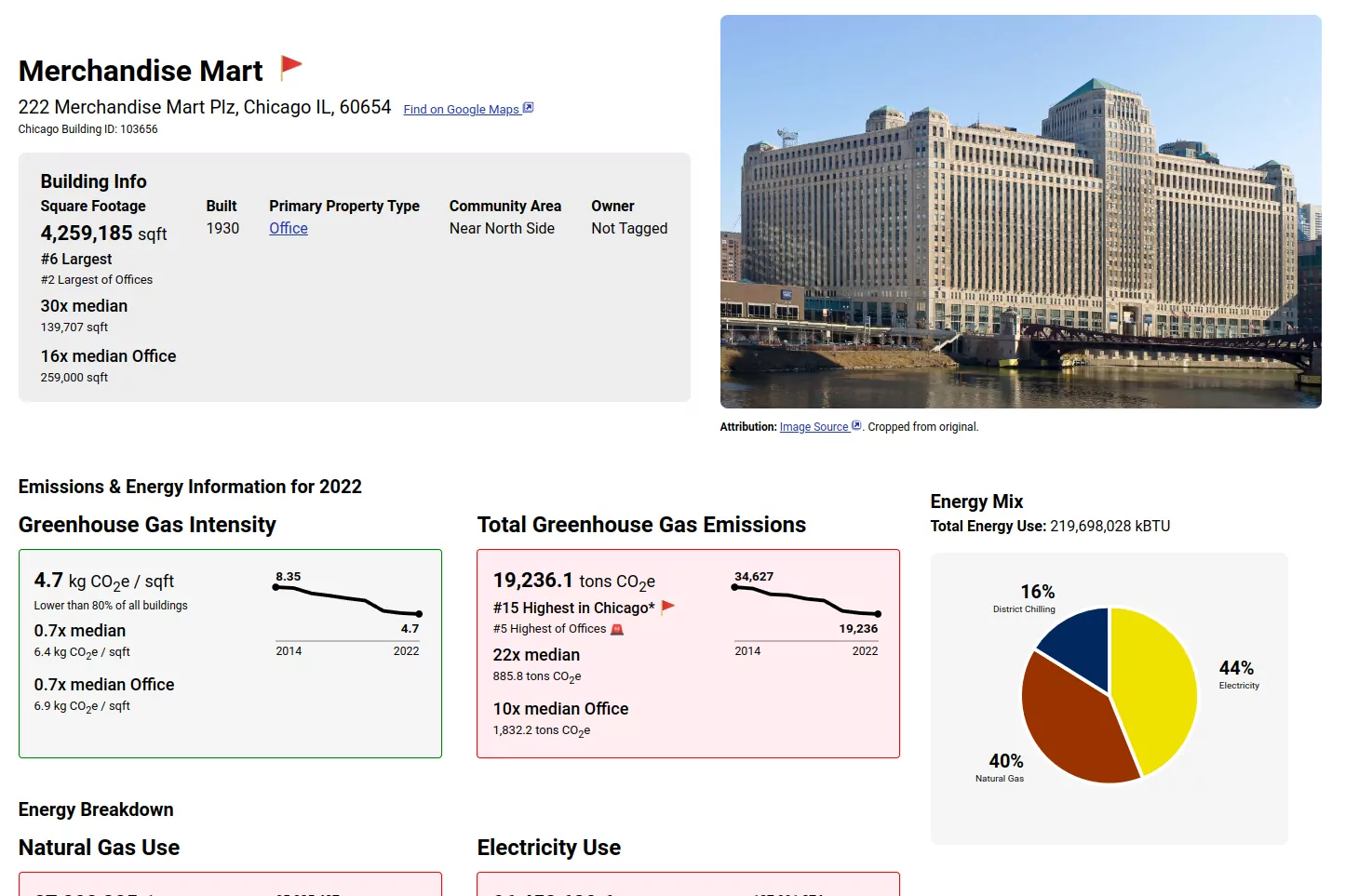
August 30th, 2024 - New Visualizations for Historic Changes & Energy Mix
We added new graphs to help visualize how buildings have changed in their emissions, emissions intensity, and energy use over time, and a new pie chart that shows the mix of types of energy a building consumes, making it easy to see at a glance if a building is mostly using electricity, natural gas, or something else!
April 2nd, 2024 - Data Update to 2022
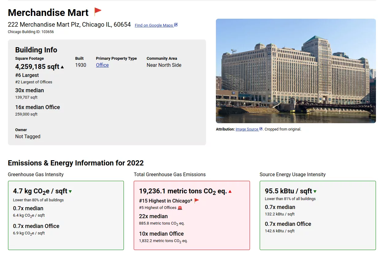
Updated the source data to the year 2022, and dropped the filter limiting buildings to the latest year on most pages, so that dirty buildings that didn't report in 2022 still show up on our largest emitter lists. Buildings shown that have old data now use a mantel clock emoji (🕰️).
August 30th, 2023 - Data Update to 2021
Updated the source data to the year 2021, which prevents being able to access 2020 data (for now) but also adds all reported buildings, removing the filter for emissions > 1,000 tons. Additionally, buildings that did not report in 2020 will have their latest year of data shown, so only buildings with data in 2020 and 2021 have data loss.
We will be working on showing historical data, including comparisons, in a future update.
Found a bug or have a feature request? File an issue on the Electrify Chicago GitHub !

